Anatomy of a Domain Dashboard
By Knowledge Base on September 17, 2024
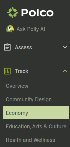
Domain Dashboards provide a focused deep-dive into each given domain, making them invaluable for understanding community performance in a specific area. To access your Domain Dashboards, click “Track” on the left sidebar, and then select the chosen domain from the dropdown menu that appears. We’ll use the Economy domain as our example for this walkthrough.
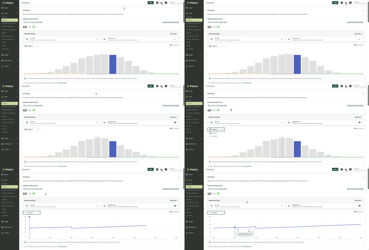
At the top of the page, you’ll see the current index score, the last update date, and the change since the previous score calculation. You can also adjust:
- Benchmark filtering options, to compare your community to others within the same state and/or population size.
- A graph, which can be toggled between a histogram (showing the distribution of index scores and your community’s placement) and a line chart (showing historical index score data for your community).
Next, you’ll see the Resident Sentiment section. Although only one or two data points appear in this dashboard view, many more indicators from those surveys are factored into the index score calculations behind the scenes.

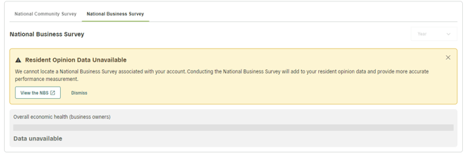
If your community has not yet completed an associated survey, you’ll see a message that reads “Resident Opinion Data Unavailable”, as pictured below.
The Community Statistics section consolidates domain-specific indicators from a variety of secondary data sources. Alongside each data point, you’ll see a benchmark comparison (when available) and the change since last measurement.
By default, all relevant data points within a domain are shown, but you can sort or filter the data in several ways:
- Filter by subdomains—for example, within the Economy domain, you can view select data points related only to business vitality, employment, or income
- Filter by specific data source
- Sort indicators alphabetically, by benchmark comparisons, or update timing
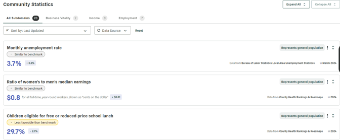
Clicking the stacked arrows at the upper-right corner of any given data point will expand each indicator to show more details and historical data. Hover your cursor over any point on the line graph to see the exact value at that time.

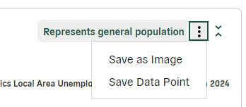
Next to those stacked arrows, you can click the three-dot menu for options to save or share that data point:
- Save as Image (which will download a .png file to your computer)
- Save Data Point (which will store this item in your Saved Data Points on Polco, for easy sharing and future reference)
Popular posts
Sign-up for Updates
You May Also Like
These Related Stories
What is included in Polco's Track Overview dashboard?
