The Power of the Community Livability Snapshot: A Closer Look at Polco's CLS Tool
By Polco on October 2, 2024

Ever wonder what a magic map for community insights would look like? Well, let me introduce you to Polco’s very own Community Livability Snapshot (CLS). It's our version of a compass for local governments, helping them navigate the complex waters of budget priorities, community satisfaction, and resource allocation.

You might’ve caught my recent chat with our Marketing Director, Angelica Wedell, where we dove into the usefulness of the CLS. (If you missed it, don’t worry—you can watch it here.) We touched on how this tool came to life and its value to both seasoned users and newcomers to Polco.
From Concept to Product: The CLS Journey
The CLS evolved from a tool we’ve used for years in our benchmark surveys, affectionately known as the Quality Importance Matrix. This tool was like a GPS for local governments, pinpointing the most important areas needing attention from the ocean of survey data. It became so invaluable that we knew it deserved a permanent place in our product lineup, and voilà—the CLS was born earlier this year.
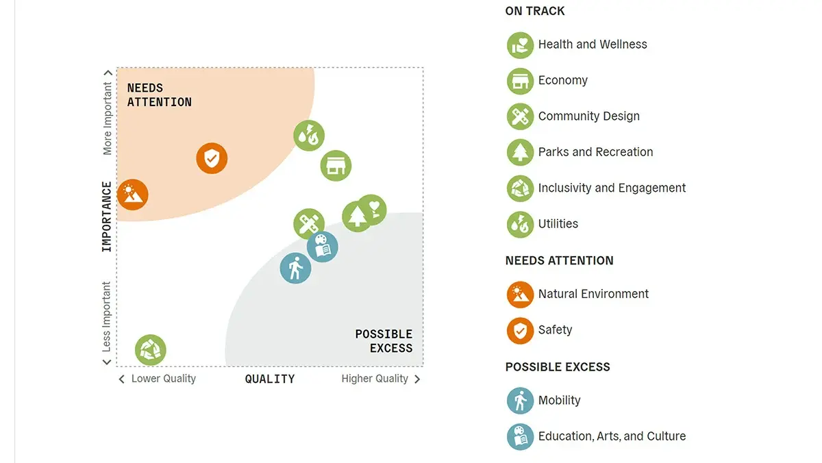
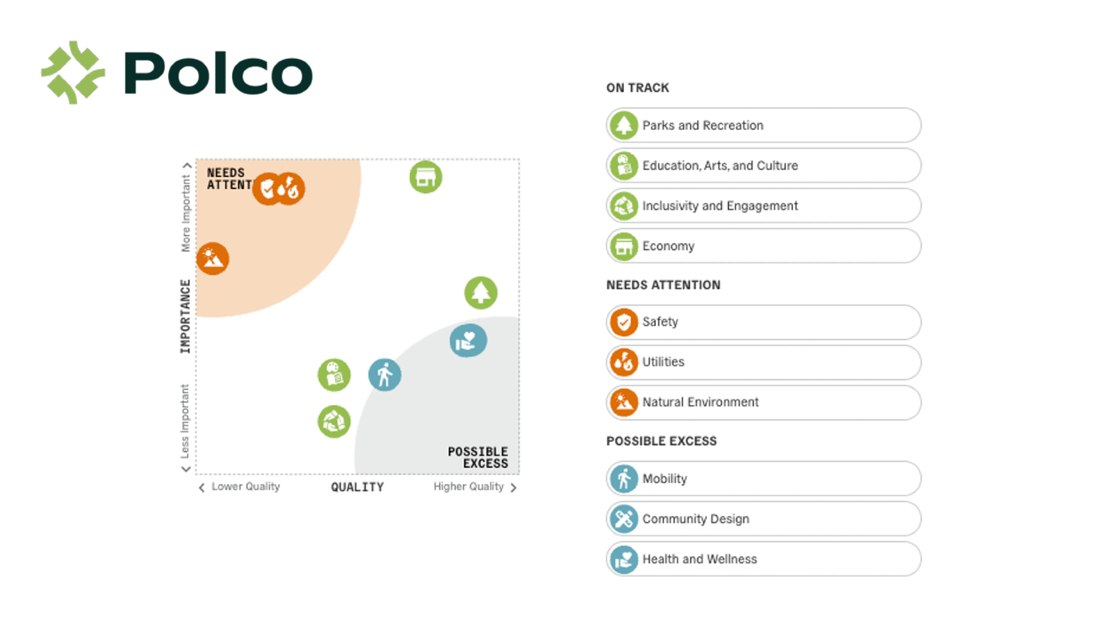
At its core, the CLS is a graph, with quality of community services running along the horizontal axis (low to high) and importance along the vertical axis (low to high). The trick here is balancing those two factors. If a service is high in importance but low in quality, that’s a red flag. Conversely, if it’s high in quality but not that important, maybe it’s an area where resources could be scaled back.
We’ve mapped out 10 domains in the CLS—things like Safety, Parks & Rec, Economy, and Inclusivity & Engagement. The graph plots each of these based on their importance in the community (using our national benchmarks) and their current performance in a given locality.
Finding the Sweet Spot: A Map with Purpose
Now, here’s where it gets fun. The CLS isn’t just a static graph. Imagine a river meandering from the bottom left (low quality, low importance) to the upper right (high quality, high importance). This “river” is where most communities aim to be—balancing resources across domains effectively. But not all areas float happily along the river.
We’ve marked the upper left corner in orange as "Needs Attention" (think: high importance, but low quality). These are areas where the community is crying out for improvement. On the flip side, the lower right corner is “Possible Excess”—great quality but not a priority right now. It’s a visual reminder that even too much of a good thing can be... well, too much.
Personalizing the Journey
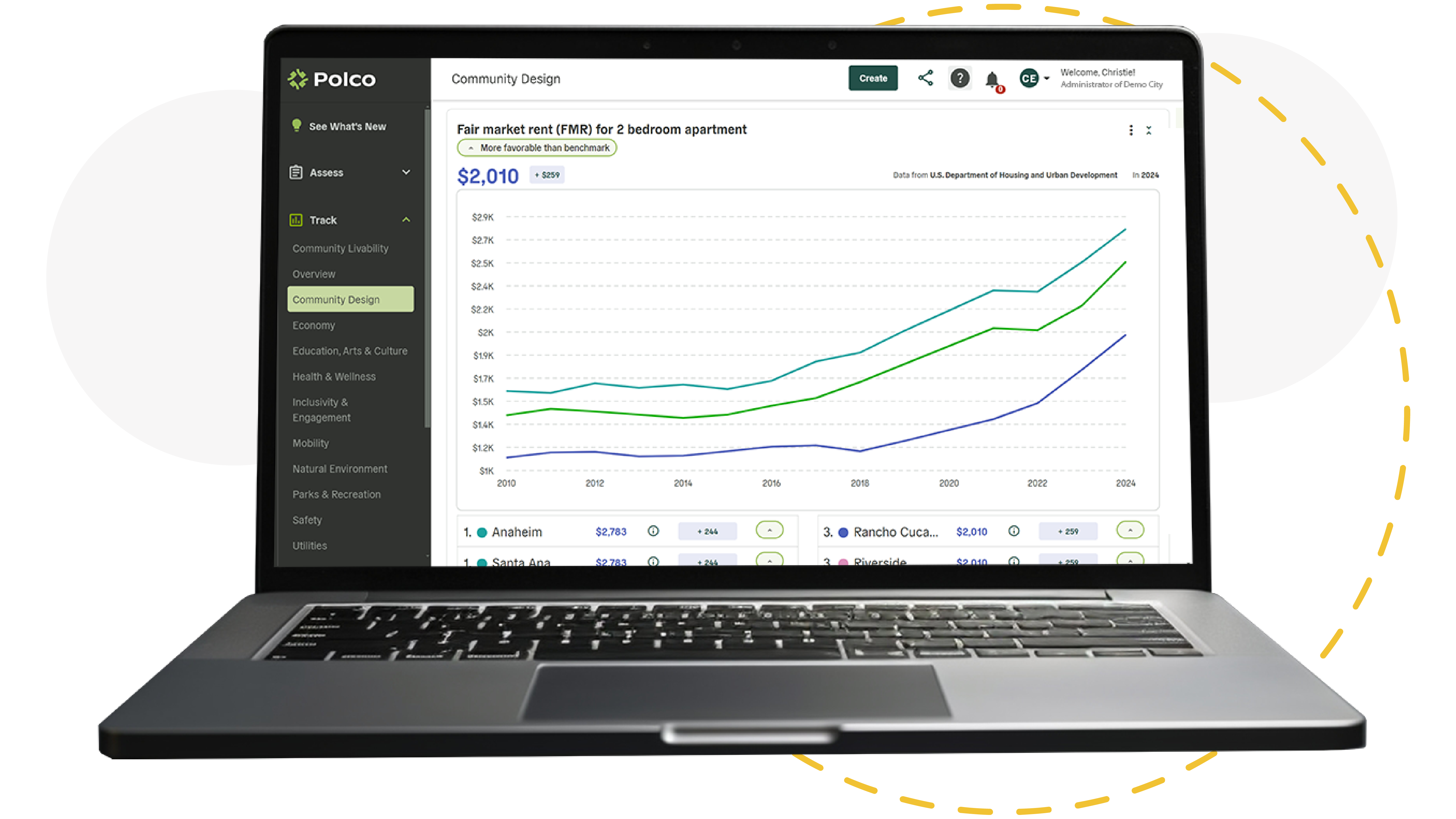
The real power of the CLS is in how personal it gets. Each community’s CLS is based on their local track data—meaning the graph reflects the unique landscape of a city or county. Want even more personalized insights? Communities can conduct specific surveys to refine the importance metrics and get a more detailed CLS tailored just for them.
And because we love making data actionable, the CLS is interactive. Clicking on any domain shows a set of recommended next steps or Polco tools that can help improve that area. It’s like having a roadmap and a repair manual all in one.
Looking Ahead
The CLS is just one of many powerful tools we’re developing at Polco. It’s designed to give our users a clear, actionable view of where they are and where they need to go, offering both a snapshot and a long-term guide.
As we continue to refine the CLS, we’ll also be improving how users can engage with and benefit from it. It’s part of our mission to make complex data simple, useful, and—dare I say—fun to work with.
Until next time, happy navigating!
Jim Schuett
Polco - Director of Product
Popular posts
Sign-up for Updates
You May Also Like
These Related Stories

Introducing Polco’s New Monthly Product Update Series: Polco Pulse

Discover Your City’s Quality of Life Performance

