How To Modernize Your Surveys and Reports
By NRC on December 20, 2017

-By Tom Miller-
Survey Research Revolution Part IV
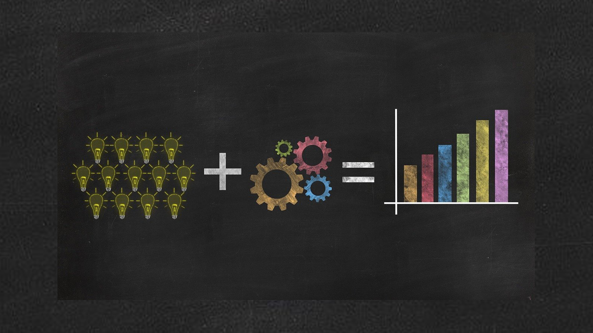
Old habits are hard to break because they usually still work. Even so, failure to modernize your surveys will eventually lead to outdated methods and out-of-touch reports. Improvements in survey deliverables likely will require an attitude of experimentation. As you consider how to compress your surveys, spice up your reports and broaden your reach, don’t let worry about false steps prevent innovation. There are plenty of opportunities to express creativity in data reporting and lots of good ideas to draw from. Implementing some or all of these newer, best practices in your jurisdiction can increase survey response rates, streamline questionnaires and bring reporting into the modern era.
Shorten your surveys.
Long surveys reduce response rates. Determine if you can meet the purposes for surveying that you have identified by collecting more surveys with shorter questionnaires that, in the aggregate, will track performance changes over time and give you important reconnaissance about resident perspectives useful for pressing decisions.
Use more than one mode and responsive design.
A robust response rate requires an accessible survey. Use a responsive design for web surveys so respondents can complete the questionnaire on any device, be it a desktop computer or a smart phone. For community surveys and older adult assessments, it is still important to recognize the existing digital divide and allow residents to return the survey by mail as well.
Lose the “telephone” book report.
Instead of a typically long report with executive summary, detailed body and appendices, make reports shorter and more focused - like briefing papers - aimed at key decision points and accessible to different user audiences.
Speak to each of your audiences.
Provide report “layering” such that each of several deliverables would aim at different audiences – a report on methods, on trends, on splits by geographic area, on splits by demographic differences, on benchmark comparisons, etc. Make sure to write in “plain English” when creating reports for general public consumption and understanding.
Display data interactively.
Offer readers the option to manipulate the data themselves using software that permits data exploration visually (like Tableau).
Create compelling content.
Produce infographics or web articles of key findings aimed at the audiences that will find the segmented results interesting. Whether your content takes the form of an image or a blog, make sure to tell the story of the results to better connect with your viewers.
Produce a video.
Create a summary video explaining results. Link to supporting documentation available online in the video description. You can also embed this video on your website and distribute it across your social media channels.
Show the geography.
Use maps to display results for different areas of the city. These maps can be color-coded to make regional comparisons easy to see and aesthetically appealing.
Reveal the big picture.
Results can be summarized creatively with word clouds or collages of related images.
Give engaging presentations in-person and online.
Engage decision-makers and line staff with interactive presentations of results to stimulate action that puts data to use. These presentations can take place at staff and town meetings, special events, or even online as webinars.
Related Articles
Popular posts
Sign-up for Updates
You May Also Like
These Related Stories

7 Steps to Maximize Your Return on Opinion

How Resident Data Informs Virginia’s State Plan on Aging

