By Polco on October 10, 2024
In today’s data-driven world, community leaders rely on tools that help make sense of complex data to guide policy, allocate resources, and improve services. Among the essential tools offered in Polco’s Track (Community Analytics) is the histogram—an often underappreciated yet powerful visualization that provides rich insights into community performance compared to others. However, many users might not realize just how much these visualizations can reveal.
In this post, we’ll explore how histograms work in Polco Track and how, with just a few clicks, you can compare your community’s performance against a variety of benchmarks using the "Compare Data Against Communities" dropdown. Whether you want to benchmark your community nationwide or by population size, this tool simplifies data comparison, helping you make smarter, data-driven decisions.

What Is a Histogram, and Why Does It Matter?
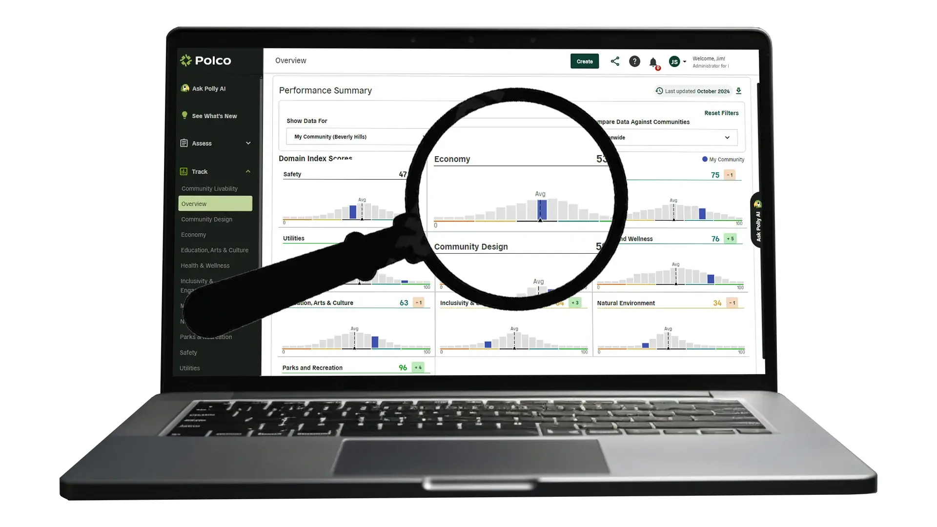
A histogram is a graphical representation that organizes data points into ranges, or "bins," providing an easy-to-understand snapshot of data distribution. In Polco’s Track, histograms allow users to see how their community’s data compares to other communities in the same benchmark cohort. These visualizations highlight the number of other communities that share similar scores and can uncover patterns that may not be immediately obvious from raw data.

Take a look at a typical histogram in Polco’s Track: multiple vertical bars, each representing a group of communities with similar scores, are spread across a scale from 0 to 100. Your community’s score is clearly highlighted in blue, while the average score across all communities is marked with a dotted line. This offers a quick visual summary of how your community is performing in relation to others.

Compare Data Across Several Methods With a Simple Dropdown
Polco Track makes it even easier to gain insights by allowing users to compare data across different categories with a simple dropdown menu. The "Compare Data Against Communities" dropdown offers several benchmarking options, each providing a unique lens through which to evaluate your community’s performance. With just a few clicks, you can switch between these comparisons and see how your community stacks up in various contexts. The options include:
-
Nationwide: This option allows you to see how your community performs compared to all other communities across the country, giving you a broad view of your standing on a national level.
-
Similar Population Size Nationwide: For a more tailored comparison, this option benchmarks your community against others with similar population sizes across the nation. This helps ensure you're comparing apples to apples, as larger communities often face different challenges than smaller ones.
-
My State: Want to focus on how you compare regionally? Select this option to compare your community’s performance with others within your state, providing insights into local dynamics and state-specific challenges.
-
Similar Population Size in My State: Combine the benefits of regional and population-size comparisons by selecting this option, which shows how your community performs relative to others of similar size within your state. This is ideal for understanding how your community fits within the local population landscape.

How Histograms Help You Make Data-Driven Decisions
Histograms, combined with the "Compare Data Against Communities" dropdown, help users visualize data distributions in a way that drives better decision-making. Here are a few key benefits:
-
Benchmarking Performance: You can instantly see whether your community is leading, lagging, or on par with others by selecting different comparison categories. For example, comparing against nationwide data might give you a broad sense of where your community stands, while using the similar population-size option could offer more relevant insights.
-
Identifying Outliers and Gaps: Histograms help identify whether your community is an outlier, either performing significantly above or below the average. Spotting these gaps allows for targeted strategies—whether that means reinforcing strengths or addressing weak areas.
-
Tracking Progress Over Time: The dropdown comparison feature is especially useful when tracking the effectiveness of initiatives over time. Are your community’s scores improving in relation to other communities nationwide or within your state? Histograms make these trends easy to spot.
-
Resource Allocation: Knowing where your community excels or needs improvement helps in allocating resources more effectively. If your community consistently falls below the average in a certain area, this could signal a need for more attention or funding.

How To Use Polco’s Histograms Effectively
Harnessing the full power of Polco Track’s histograms and comparison options is simple. Start by exploring the different ways your data can be viewed:
-
Nationwide vs. Similar Population: First, see how your community stacks up against national averages. Then, refine your analysis by looking at similar-sized communities. This can help you determine whether certain challenges or achievements are population-specific or more widespread.
-
State Comparisons: The state comparison allows for a more localized evaluation. This is particularly useful for identifying state-specific trends or challenges that might not be as evident when viewing national data.
-
Combine with Other Insights: Layering your histogram analysis with other insights—such as resident surveys or demographic information—can lead to more comprehensive decision-making. You’ll not only know where your community stands but also why.

Engage Stakeholders With Data-Driven Stories
The combination of histograms and the "Compare Data Against Communities" dropdown offers powerful visual storytelling. These tools can help engage stakeholders—whether city council members, local government, or the public—in meaningful conversations about community needs and priorities. With the ability to clearly show how your community is performing against a wide range of benchmarks, data becomes more actionable and decisions become more impactful.
Conclusion: Visualizing Your Community’s Data
Polco’s Track histograms provide a simple yet powerful way to visualize complex data. By understanding the distribution of data across different benchmarks—whether by population size, statewide comparisons, or national averages—you can make more informed decisions to benefit your community.
With just a few clicks in the "Compare Data Against Communities" dropdown, you can access a wide array of comparisons that transform raw data into insightful visuals. Whether you’re benchmarking against similar-sized communities nationwide or seeing how you stack up locally, histograms provide the clarity needed for smarter resource allocation, policy decisions, and long-term planning.
Unlock the full potential of Polco’s histograms today and discover the hidden stories within your community’s data.

1 Million Strong: How BPC is Driving National Civic Engagement with Polco

How Edmonds School District Reimagined Community Engagement through Budget Simulations
