
By Polco on August 19, 2025

TL;DR: You’ve published the stats. The dashboard is live. The spreadsheet is public. So why don’t people trust it? In 2025, transparency means more than releasing data, it means making it understandable, relatable, and honest. Here's how to rebuild trust when raw numbers fall flat.
“We Put It All Out There. Why Don’t They Believe Us?”
You’ve done everything right… on paper.
- You posted the charts.
- You uploaded the reports.
- You cited your sources.
- You showed the numbers.
But the public reaction?
- “This feels cherry-picked.”
- “I don’t trust this.”
- “What aren’t they telling us?”
This is the data dump dilemma: when transparency without clarity leads to confusion, skepticism, or even backlash.
The Real Problem: People Don’t Need More Data. They Need More Trust.
When every chart is met with eye-rolls, and every stat is seen as spin, the issue isn’t just communication, it’s credibility.
Here’s why that happens:
- Data without context feels manipulative.
- Charts without stories feel cold and technical.
- Progress without acknowledgement of challenges feels dishonest.
In short: people don’t trust what they don’t understand—and they won’t believe what doesn’t feel real.
How to Fix It: Clarity, Context, and Co-Creation
1. Pair Every Stat With a Story
Instead of just saying, “Crime is down 12%,” say: “While overall crime is down, residents in Southside still report feeling unsafe walking at night. Here’s what we’re doing about it.”
That’s real. That’s honest. And it builds trust.
2. Make Data Interactive, Not Just Informational
Static dashboards are nice. But interactive tools are better.
Let residents:
- Explore where their tax dollars go
- Try budgeting themselves
- Rank priorities for their neighborhood
- See how their feedback compares to others'
This kind of participation transforms passive data into active understanding.
3. Use Third-Party Validation
When the city says, “We’re doing great,” people raise eyebrows. But when a neutral partner provides the data? That hits differently.
That’s where Polco comes in.
How Polco Helps Governments Rebuild Trust with Data
For over 30 years, Polco has helped local governments close the gap between data and trust. Our tools don’t just present information, they help residents see themselves in the story.
Here’s how:
- Track — Dashboards that combine objective metrics and public perception across 11 core domains of livability.
- Community Surveys — Scientifically valid, benchmarked surveys that reflect real resident experiences, not just assumptions.
- Simulations & Prioritization — Budget tools that let people experience trade-offs and give feedback on what matters most.
- Expert Staff Support — Our team of data analysts, engagement strategists, and former public administrators work alongside your staff, not just to publish data, but to make it matter.
Whether it’s explaining crime stats, sharing economic performance, or planning a parks budget, Polco helps you translate complexity into clarity, and build trust with honesty.
Final Thought: Don’t Just Show the Data. Show Your Work.
Transparency isn’t just about making data public. It’s about making data human. When people understand what the numbers mean, and how they were collected, they’re far more likely to trust them. Even when the news isn’t good.
And that’s where lasting trust begins.
Want Your Data to Build Trust, Not Doubt?
Let Polco help you go beyond the data dump and connect with your community through transparency that actually resonates.

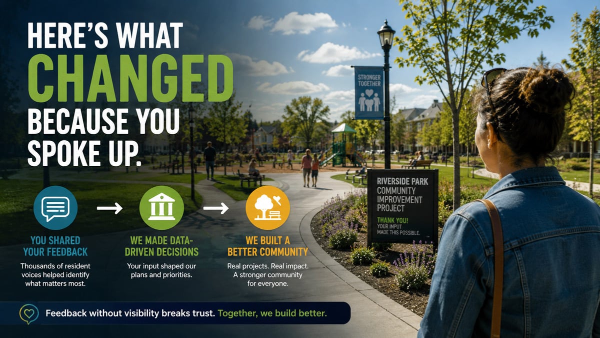
How to Turn Resident Feedback Into Decisions People Can See
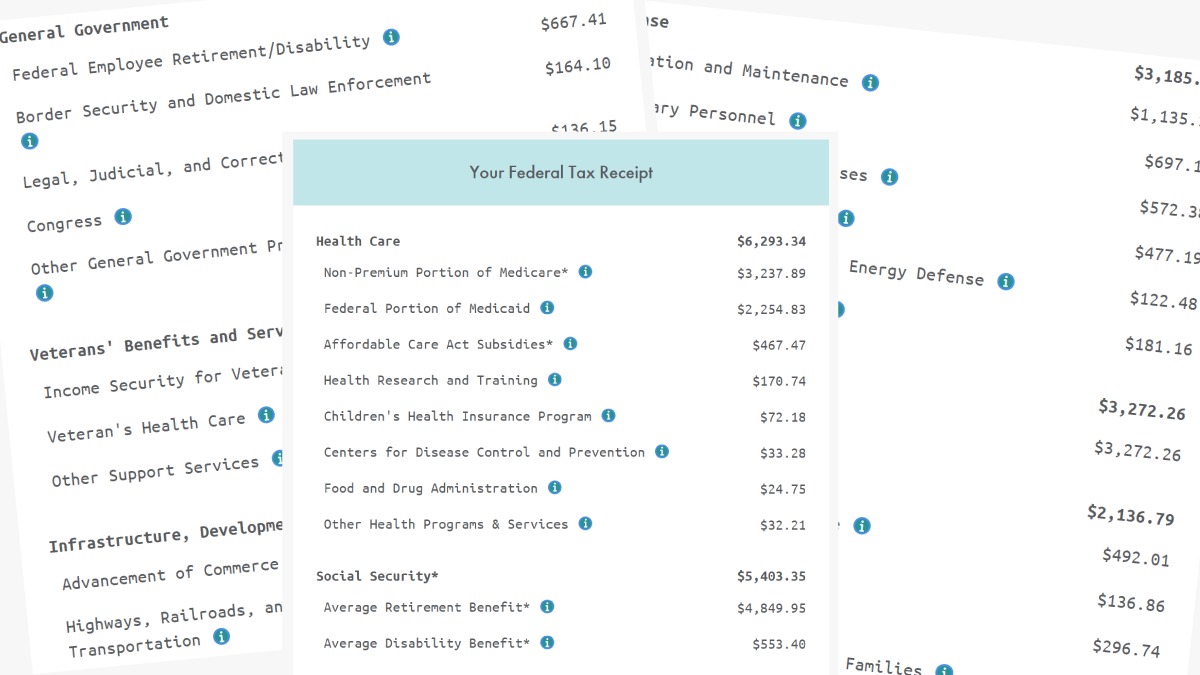
Where Do Our Tax Dollars Go?
